To identify which filter should be applied and what is the relative effect of different frequencies are in the time series, a statistical technique called spectral analysis is employed. This method includes building and analyzing periodograms or spectra, which are the plots of variance in each fixed frequency interval versus frequency. Figure 1 shows an example of periodograms for daily maximum temperature, and its low pass and high pass filtered series.
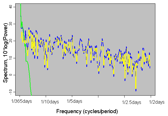 |
| Figure 1. Spectrum plots of daily maximum temperature (blue solid line) at Fort Smith, Arkansas, low pass filter of this series (green solid line), and high pass filter (yellow dashed line) |
Original Tmax series (blue solid line in Figure 1) has highest spectrum power at lowest frequency (1 cycle per 365 days): frequency of the annual cycle. Removing this with the low pass filter (green line) preserves all high frequencies (yellow dashed line) of the original series (spectrums are overlapping).
REFERENCE:
Chatfield, C, 1995, The analysis of Time Series, 4th edition. Chapman & Hall