Data displays
The initial data display contains:
- the forecast point name
- graphs
- tabular data
- information lines
- buttons that trigger other tasks when selected
There are two types of graphs displayed.
Near the top of the screen, under the forecast point name, are two bar graphs that display the mean areal precipitation and runoff or stream inflow time series for the forecast point.
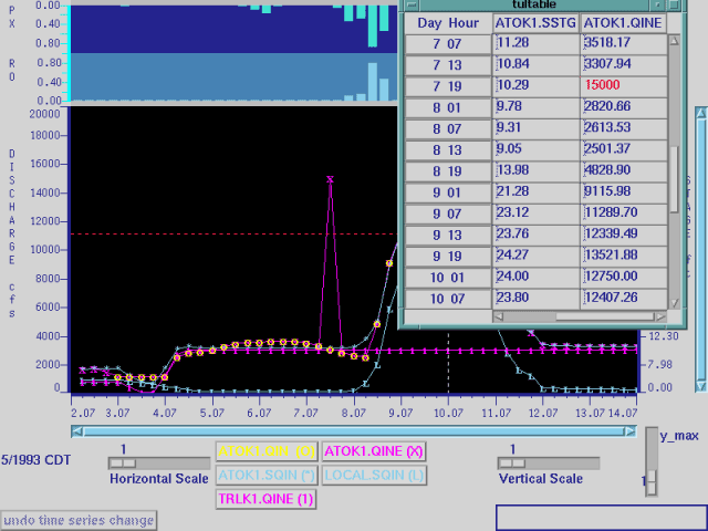
As previously mentioned, the forecaster can use this display to interactively make changes in the time series data for the model.
This may be necessary if, for example, the forecaster receives a corrected value from an observation point.
There are two ways to do this, either by drawing in points on the graph or by entering new values into the table.
To enter points on the graph, the name of the time series in the legend is selected.
The graph is redrawn with the selected time series displayed in white and a series of vertical lines drawn on the graph.
New values are then chosen by selecting on the graph where the new values should be.
An open circle is drawn at the selected point.
After entering all new values, the name of the time series is selected again and the graph is redrawn with the new values shown in the graph and in the table.


