

2.6 Data Editing Methods
The Plots tab offers two options: graphical and tabular editing. You can use either of these methods when you are compiling input to the forecast.
Note: The changes you make in this interface will not be saved or transmitted outside the RFC.
Hint: Click any of the images on this page to enlarge/shrink.
Graphical Editing
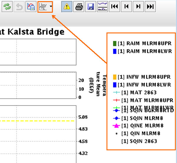
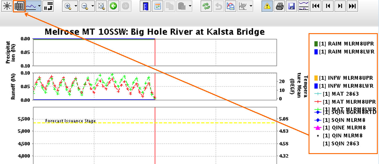
Options in the button bar become available after you click a physical element on the time series legend.
The legend and the edit icon are outlined in orange on the graphic on the right.
Graphical Editing Options
The options in the Graphic Editing drop down (as shown in the image to the right) are described below.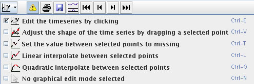
- Adjust by clicking (default) on points on the time series plot where you want values (stage, flow, precipitation, etc.).
- Move points allow you to edit points in between the first and last ones selected. You cannot work on the last point you select.
- Linear interpolate provides a smooth transition between points.
- Set missing between points is a good option if you know the gage was out during certain dates.
- Quadratic interpolate is similar to the “linear” option, but this option performs a quadratic rather than linear interpolation.
Hint: If you like the hydrograph you "drew in", you can click the copy icon and paste the hydrograph elsewhere - even a different segment.
Tabular Editing
You must click the Chart button in the button bar to access the data table.
The table is view only unless a physical element is selected on the time series legend.
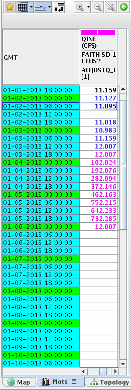
Once the data table is open and in edit mode, you can edit the table by clicking the column heading to make it active.
You can copy and paste information, add it using the keypad, or select cells to interpolate between points.
The values in the table are color-coded:
- black – original data
- blue – interpolated data
- magenta – data added via graphical editing
- purple – data added during tabular editing session (Note: Subtle difference between the purple and blue values)

Use the following job sheets to edit erroneous data in a data table or graphically.